The power of Statistics.
Woo hoo! Winter is over! Today is the first day of Spring which means the Canberra winter has officially come to an end. This year seemed especially cold to me but was it colder than normal? That is the question and if you listened to the radio this morning it depends on which report you were listening to as to whether it was indeed an especially cold winter. One report I heard today said that if Canberrans felt it had been a cold winter they were right, and another report said it was no colder than usual. One would think that the weather, the temperature, was a fact. Therefore, it was either colder than usual or not. That however, is the joy of statistics. When first encountering statistics in my student days, I naively thought that they were fact. They are as they are. I have since learnt that statistics, are open to interpretation. While it might be true that the average temperature during winter was x degrees, there is then some flexibility in how that information is interpreted. Is it compared to the average in the past 10 years? Or since records started? Is it important to take into consideration the amount of nights below zero? The number of days over fifteen degrees? Or how long the maximum temperature was reached for on a given day? You get the general idea. The thing about statistics is that people can use them different ways. It irks me when people try to use them in a misleading way. The power of statistics is that if one does realise that they can be subject to interpretation, then they can be interpreted as fact or indeed the data can be presented differently in order to convey the desired message. For example, consider a graph where the scale is reduced so that instead of having 0 to 100%, it shows 99 to 100%. The effect of this is that a non-significant difference between two statistics can suddenly appear to be very significant. Someone presenting the information in this way can manipulate the data in order to show what they want.
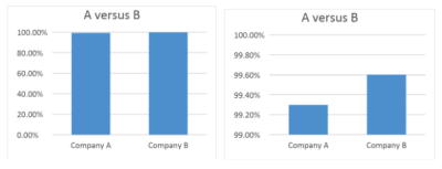
In these two graphs, the data difference between the two companies looks quite different, simply by changing what is represented in the scale.
Consider another example, often we have scientific studies that can be used to show the difference between two groups. For example, maybe Group A performed better on a memory test than group B and Group A was given a dietary supplement with a magic compound whereas group B was not. This may be presented by the company in such a manner that it promotes sales of the dietary supplement. However, if not all the information is presented, it may appear that the dietary supplement makes a significant difference when really it does not. Whether the difference between the two groups is significant depends on the size of the two groups, the variability between the two groups and whether there are any other factors influencing the difference between the groups (maybe one group was older). It is also important to know how sure we are that the difference is significant- what is the probability that the difference is just due to chance.